
Storytelling trick to evolve your reports to the next level – Part 1
In today's article we will learn how to give our reports a special touch to add even more information. Let's explore, therefore, the tooltips (English), or better known for descriptions in Portuguese.
It's a feature that I really like to use, as it can help make analyzes much more intuitive.
Some examples
In the demos of our website, I usually use different types of custom tooltips. And the cool thing about it is just being able to customize it in our own way.
Let's look at some examples:
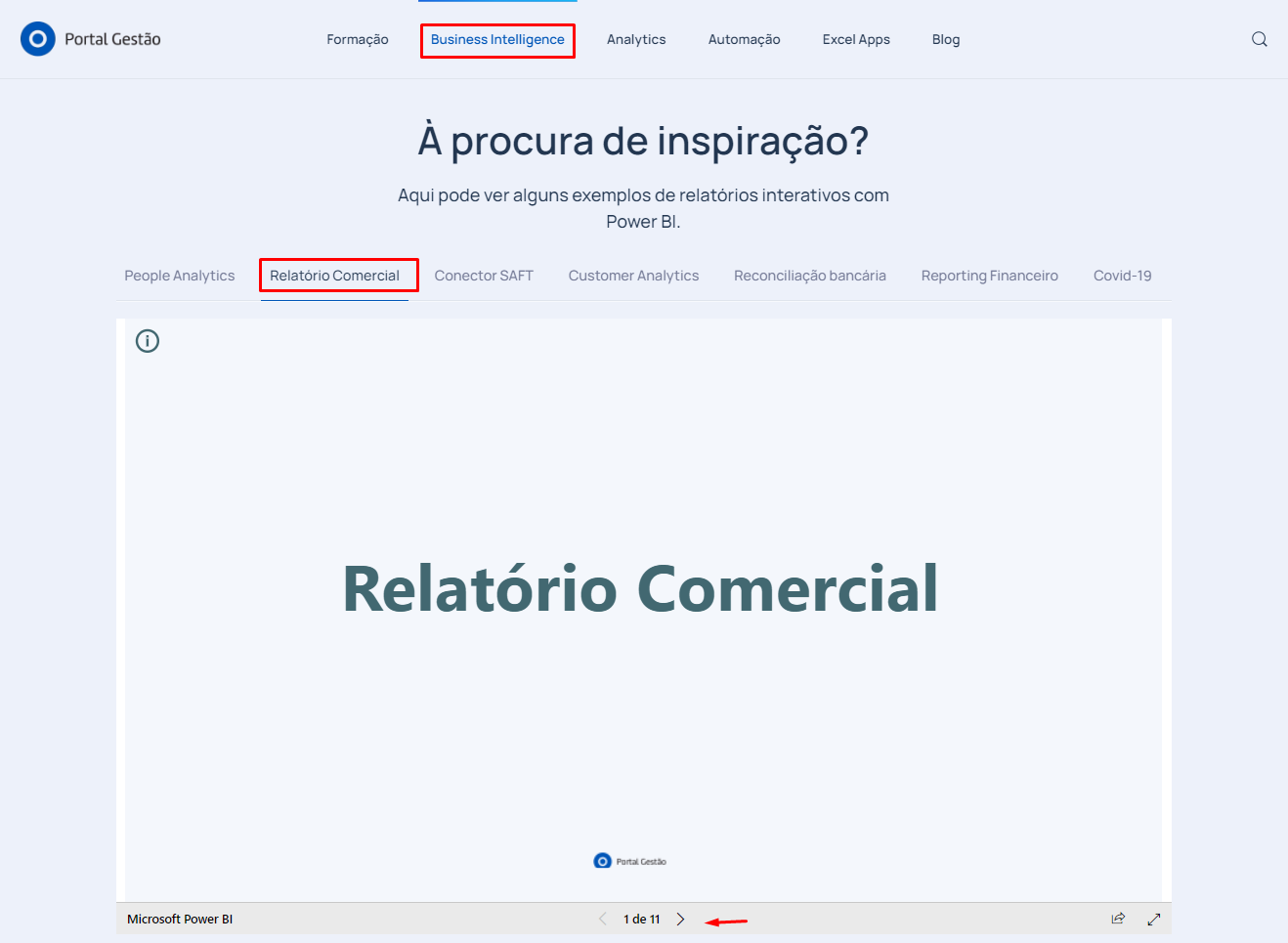
#Note: these examples can be found on our website, in the business report
https://www.portal-gestao.com/business-intelligence-analytics.html
Tip
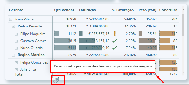
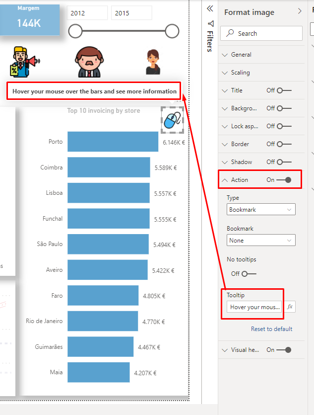
To signal users that we are using this feature, it’s a good practice to insert icons or images that point to it. As is the case with the mouse images that I insert:
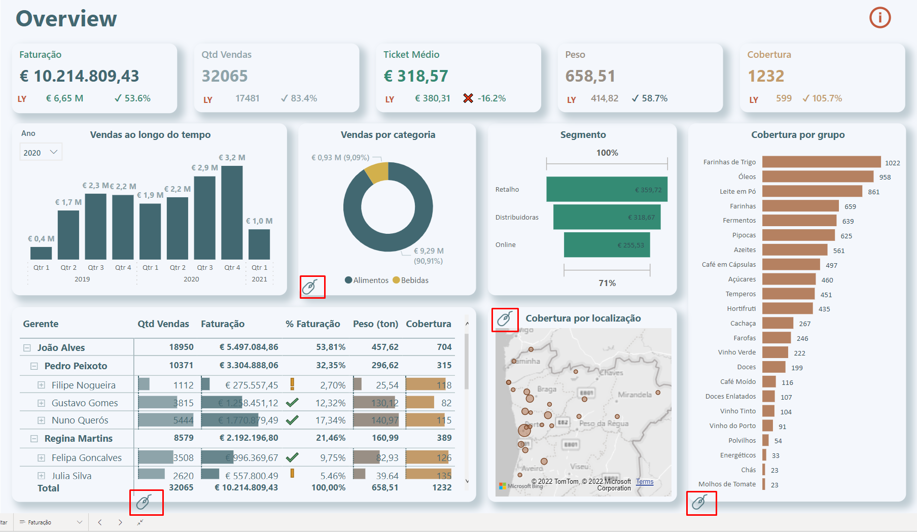
In this way, the user sees that there is some visual element that can be hover by the mouse to get something different. And not only that, when you hover your mouse over it, you will have a message saying: 'Hover your mouse over the graph and see more information'.
Practical Case
In Power BI, every time we created a visual element, the tooltips automatically appear when we hover the mouse over. But in a simple black box:
The good news is that we can customize this black box to display other types of information.
How to make?
To create a custom tooltip (Description), we can do it as follows:
1) We added a new page to the report, on the + sign
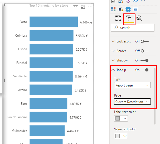
2) Format it in the ink roller > Page info > Give the page a name > Activate the ‘Description’ option
3) In the option 'Page Size' > change the type to 'Description'
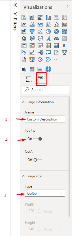
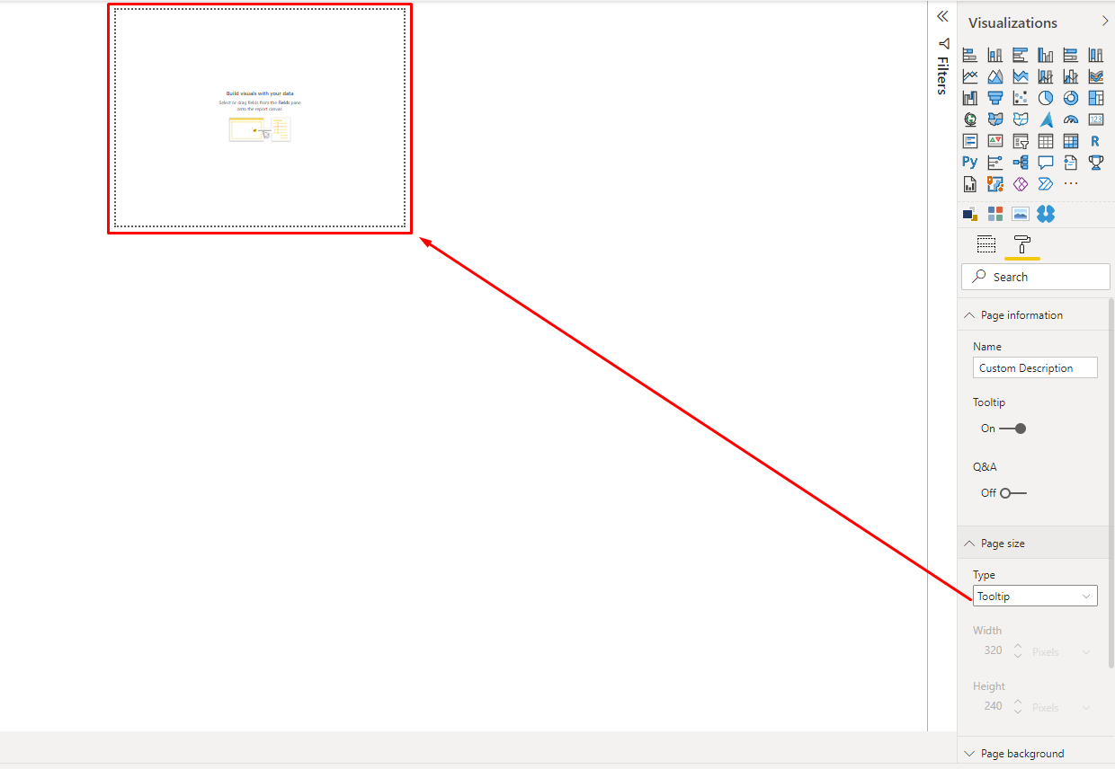
Note that the page will be much smaller. Which makes sense, because tooltips don't have to be huge and take up the entire page.
Once these initial settings have been made, it is up to the report builder to decide how to customize the tooptip and which visual elements to insert.
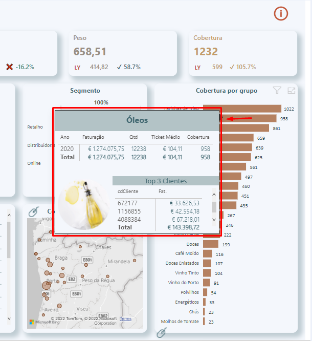
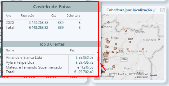
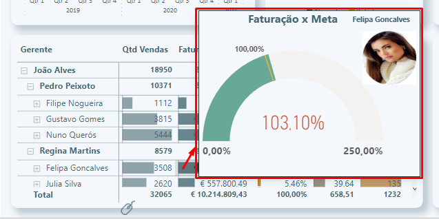
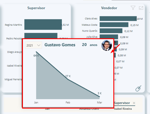
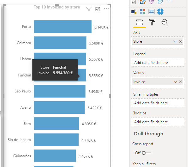
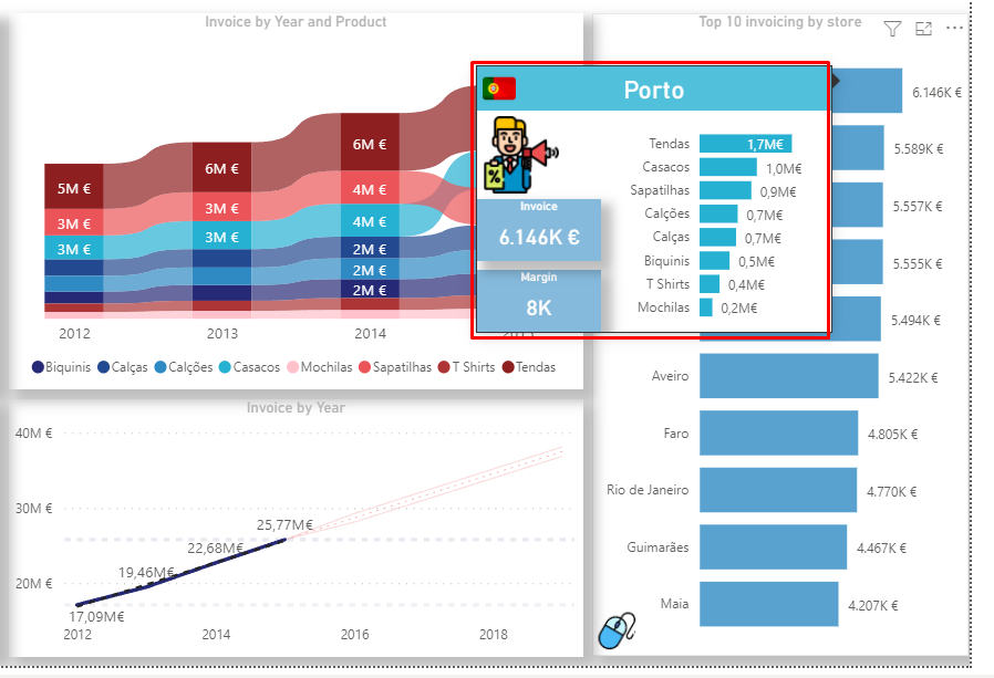
Here is my suggestion for this fictional case:
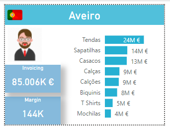
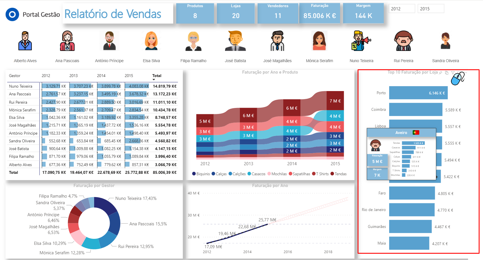
In which I added the name of the store, the flag of the country, the image of the seller responsible for that store, the invoicing and margin of the same, as well as the invoicing by product.
We don't want this tooltip page to be visible to users when we publish to Power BI Service, therefore we will hide it.
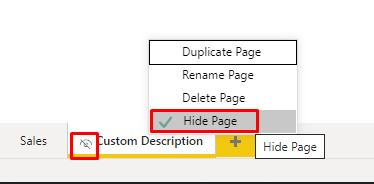
Hiding this page means that in Power BI Desktop it is still available for editing and viewing, but then when we publish to Power BI Service it does not appear. Unless we introduce some action or tooltip, which is the case.
That done, now we go back to the sales page, in the graphic where we want to introduce the tooltip, when we hover over it, click on it > Go to the ink roller > Description > Type: Report page > and choose the page we created for the tooltip, which in this case we call it 'Custom Description'.
And that's it! That simple.
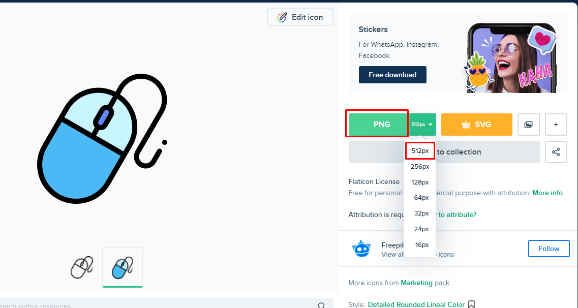
To add the mouse image to signal to users that we have a tooltip hidden there, let's download an image from the internet and insert it in the report.
- We will download the image from the following website, in png format with the best possible quality (512)
https://www.flaticon.com/free-icon/mouse_1787045?term=mouse&related_id=1787045
- On the Insert ribbon of Power BI Desktop, select the ‘Image’ option
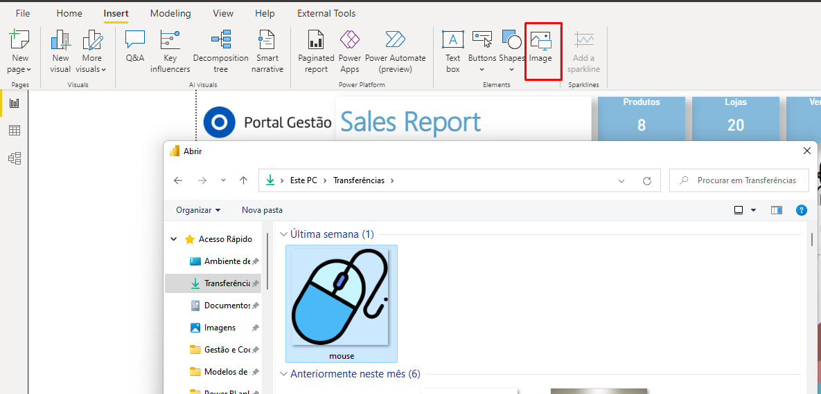
- Reduce and resize the image to fit the corner of the intended graphic.
-
In the image formatting options, enter in the action description the text you want the user to see when hovering the mouse over the figure. Something like “Hover over the bars and see more information”. That way, the user doesn't have to guess that there's something else there, since we're signaling.
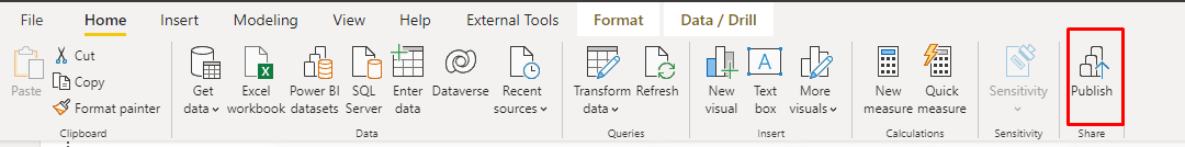
Now let's see how it will appear in the Power BI Service, then publish the report:
When viewing in Power BI Service, as we only had one page visible, only that page will appear. And when we hover over the top 10 stores' billing graph, it will appear in the custom description box.
Conclusion
The tooltip feature that we saw in today's article can be useful in many contexts, for example,
- Detail more information
- Add more value to analytics
- Avoid visual pollution on the page, without having to add dozens of graphics on a single page.
I hope you enjoyed this tip and until the next article, which we will talk about bookmarks. Another cool Storytelling feature that takes us to an even higher level :DD
Kisses and see you in the next article
Isa
