- Imagem:
In the vast and vibrant world of graphic design, colours play a crucial role in creating a captivating and impactful visual language. From the careful choice of palettes to the harmony between tones and contrasts, colours are a powerful tool for conveying messages, evoking emotions and establishing deep connections with the target audience.
In this article, we explore the essence and importance of colours in graphic design, from their psychological impact on emotions to their influence on branding and usability.
Introduction to Colour in Graphic Design
Colours represent a powerful visual language that transcends linguistic barriers to convey instant messages. They go beyond simple shades, being fundamental elements that influence emotions, arouse sensations and establish deep connections with the public.
The selection of colours goes beyond aesthetics and plays a crucial role in visual communication. Colours have the power to influence a viewer's mood, perception and even behaviour.
They can define:
- a brand's identity,
- highlight important information
- and direct focus to specific elements in a design.
The careful choice of colours in graphic design is a strategic element that can strengthen the desired message and create an immediate emotional connection with the target audience. Mastering the art of colour in graphic design is a powerful tool for communicating messages, telling stories and creating lasting visual impact.
3 Examples of brands that stand out for the way they use specific colours to create identity:
- Coca Cola (Red)
- Starbucks (Green)
- IKEA (Blue and yellow)
The Influence of Colours on Emotions and Behaviour
When it comes to influencing emotions and behaviour, colours have the power to psychologically affect the target audience. Red, for example, can evoke feelings of passion, urgency or even anger, while blue tends to convey calm, confidence and serenity. These associations are fundamental to directing the perception of brands and their messages.
By exploring colours, designers can create visual experiences that stimulate specific sensations, influencing the behaviour of the target audience in a subtle but powerful way.
Example:
- A restaurant might choose shades of red to stimulate customers' appetites, while a medical clinic might opt for shades of blue to convey confidence and reassurance to patients.
Use of Colour in Branding
In the world of branding, colours play a role in how brands are perceived and connect with their audience. Great brands understand the power of colours and how they can create instant associations in the consumer's mind.
- Coca-Cola's vibrant red, for example, not only catches the eye, but also evokes energy, passion and joy, creating an emotional connection with consumers.
- Facebook's comforting blue conveys confidence, security and serenity, reinforcing the idea of a friendly and reliable platform for connecting with other people.
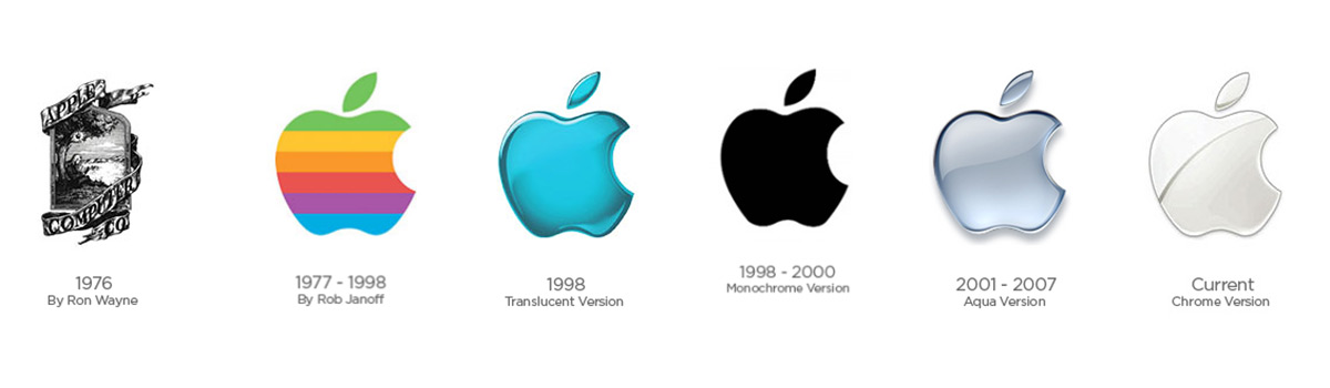
Apple is an outstanding example of how consistency in the colour palette can reinforce brand identity. Its consistent use of white and silver conveys simplicity, elegance and innovation, creating an immediate association with high-quality products and sophisticated design.
In addition, colours are also used to segment the market and attract different target audiences. For example, children's product brands often use vibrant colours such as pink and blue to attract the attention of children and their parents. In other words, the use of colour in branding is a powerful tool for conveying values, creating instant recognition and generating lasting connections with consumers.
Contrast and Harmony
The balance between contrast and harmony is essential when choosing colours. Both contrast and harmony are key elements that influence the way colours interact and are perceived by the human eye.
Contrast allows important elements to stand out, while harmony ensures that the colour combination is visually pleasing. Techniques such as the colour wheel and gestalt theory are often employed to create striking and coherent combinations.
By understanding the principles of contrast and harmony, designers can create visually appealing compositions that convey the desired message effectively.
Accessibility and Usability
To ensure the inclusion of visually impaired people in design, it is essential to consider the use of colour in accessibility and usability, creating experiences that are accessible to all.
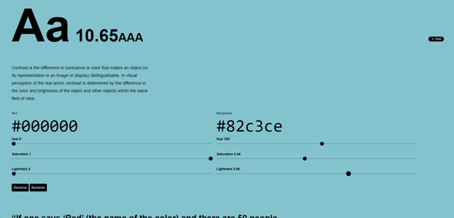
It is necessary to consider the contrast between colours to ensure that content is legible and understandable by people with visual impairments such as colour blindness or low vision. Using colours that have sufficient contrast between the text and the background can make a huge difference to the readability of the content. The "colourable" website is an excellent tool, as it allows a more in-depth study of the contrast to be used. It assigns a combination between the background colour and the text colour, ranging from 'Fail' (unsatisfactory) to 'AAA' (excellent)."
However, it is essential to find a balance. Excessive use of colour can cause distraction and make it difficult to understand information. It is important to ensure that colours are used consistently and meaningfully to create an intuitive and effective user experience.
Conclusion
In the world of design and communication, colours are much more than an aesthetic touch. They have the power to arouse emotions, shape interactions and ensure inclusion. From their psychological impact on audiences to their role in accessibility and usability, the careful choice of colours is vital for engaging and inclusive experiences. They constitute a universal language that defines effective designs for everyone, excelling at emotional connection in branding, visual composition and attention to accessibility. Awareness of their use leads to memorable designs and inclusive experiences, always with an awareness of the transformative power of colours and the ethical responsibility when applying them.
Thanks for reading and I hope you enjoy it. See you soon 😊
